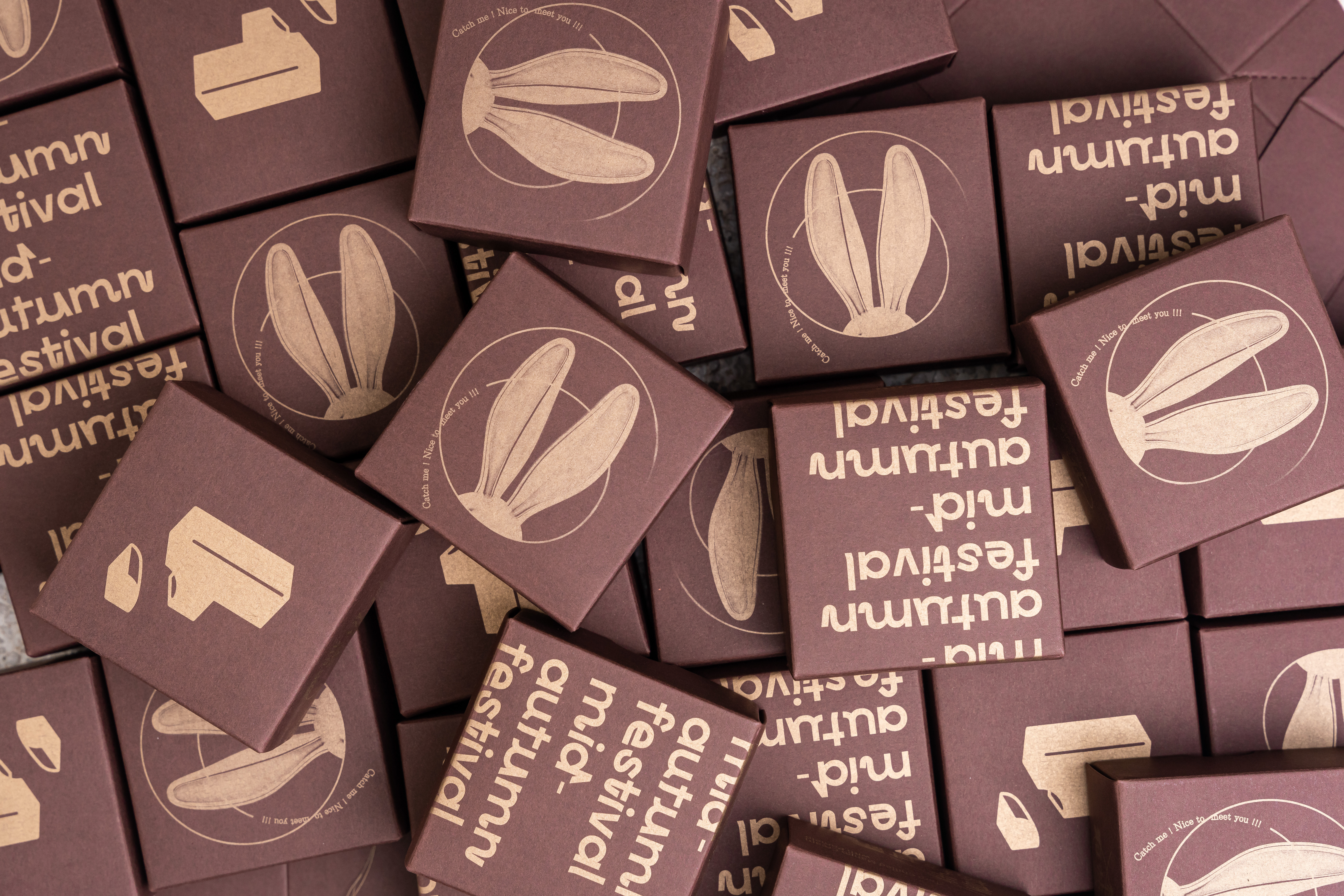

Family Connection Counselling is a private practice based in Fremantle, a small port town in Perth, the capital of Western Australia. They offer online counselling, EMDR therapy and supervision service for registered counsellor across the country. For this project, an opportunity has come up from our longstanding "connection" between the client and me. And together, we collaborated to create a logo and brand colour palette that embody the concept and philosophy of her new business.
Family Connection Counsellingは、西オーストラリアの州都パースの小さな港町、フリマントルに拠点を置く個人診療所です。オーストラリア国内の患者に向けて、オンラインカウンセリング、EMDRセラピー、カウンセリング専門家向け監修サービスを提供しています。今回、私がロゴの制作とブランドカラー選定の機会を得たのは、クライアントとの長年の「繋がり」によるものでした。こうして、彼女の新しいビジネスと哲学を反映したロゴを制作すべく、コラボレーションを果たすこととなりました。


The initial brief from the client was to create only a logo symbol that visually represent “connections” as ultimately that is what “counselling” can represent, and as what all individuals desire in deep in mind. To start, I began by sketching associated elements based on the concept, as well as referring to sketches provided by the client, and conducting research to select relevant keywords.
From the various ideas popped up during this process, including designs resembling mandalas representing the circle of life, designs evoking the embrace of nature, and collages of related elements, we narrowed down the appropriate designs and directions.
初期の段階でクライアントが希望していた内容は、カウンセリングが最終的に来談者にもたらすもの、そして全ての人々が心の奥底で求めている「繋がり(Connection)」を視覚的に表したロゴマーク、というものでした。このコンセプトと、クライアント側から提出されたイメージスケッチをもとにして、連想されるエレメントのスケッチ、関連キーワードの選出とスケッチを行いました。
人の生を円形として表した曼荼羅のようなデザイン、人が自然の中で抱かれているようなデザイン、関連要素のスケッチをコラージュしたデザインなど、過程上で産まれた様々なアイデアの中から、適切な要素を絞り込んでいきました。

After some refinements, we reached the realisation that the logo deemed most suitable was one composed of the initial black and white sketches. The sketch - resembling a doodle naively drawn by kids, aligned well with the client's philosophy as a counsellor that we are all essentially just big kids trying to act like grown up. And the human mind is always unstable, elusive, and never in a perfect state. These human imperfection was accurately expressed through this doodle.
何度かリファインを重ねた結果、ロゴとしてもっとも相応しいと判断されたのは、一番最初に提案した白黒のスケッチから構成されたデザインでした。不完全な線で描かれた子供の落書きのようなスケッチは、「人は皆、大人のように振る舞おうとしている大きな子供にすぎない」というカウンセラーとしてのクライアントの哲学とマッチしており、また人の心とは常に不安定で捉えどころのないものであり、完璧な状態でいることはまずありえない。そんな不完全さを的確に表現しているとして、採用に至りました。
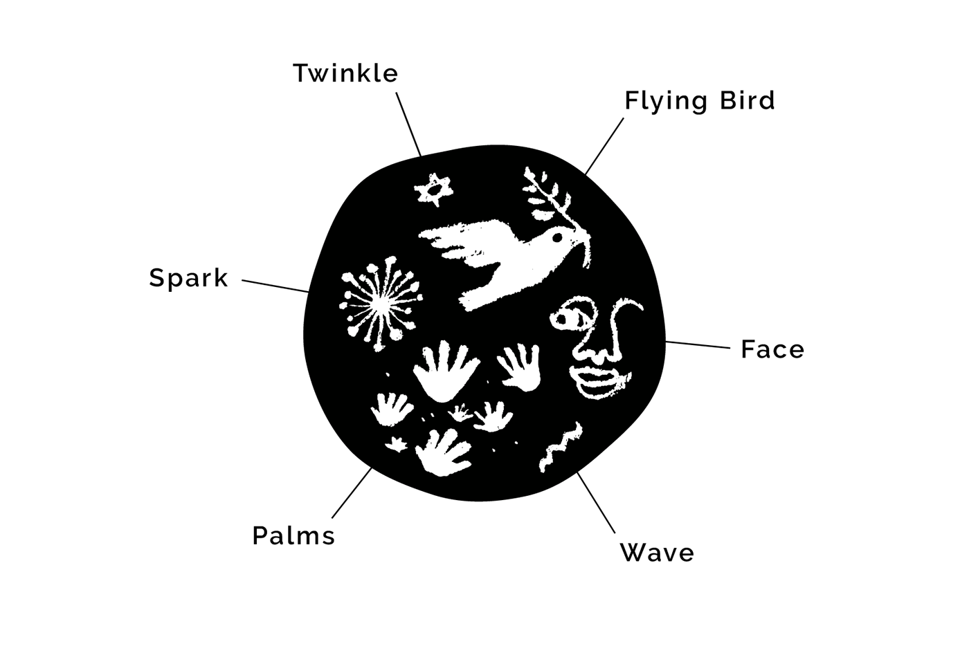

The elements incorporated into the logo, and their representation include: a flying bird representing peace and freedom, palms representing the human desire for connection and trust, a twinkle and spark representing the light of hope in darkness, a wave representing the ever-changing human mind, and a half face representing the persona of visitors. These elusive human conditions which appear randomly and fleetingly in the human mind, are scoop up within a circular shape with swaying edge representing the fluctuating mind, as if to making them more definitive—as the symbol of counselling.
スケッチの中からロゴに取り入れたエレメントとそれらの意味については、羽ばたく鳥は平和と自由を、手のひらは繋がりと信頼を求める人の嘆きを、瞬きと花火は暗闇の中での希望の光を、波は常に揺れ動く人の心を、そして半分だけ描かれた顔は来訪者のペルソナを表しています。人の心の中に闇雲に現れては消える捉えどころのないこれらの人間の状態・感情を、ゆらぐ心を表した円形の中に掬う(すくう)ようにして集め、より把握しやすいものにする=カウンセリングを象徴するロゴデザインとしてまとめています。

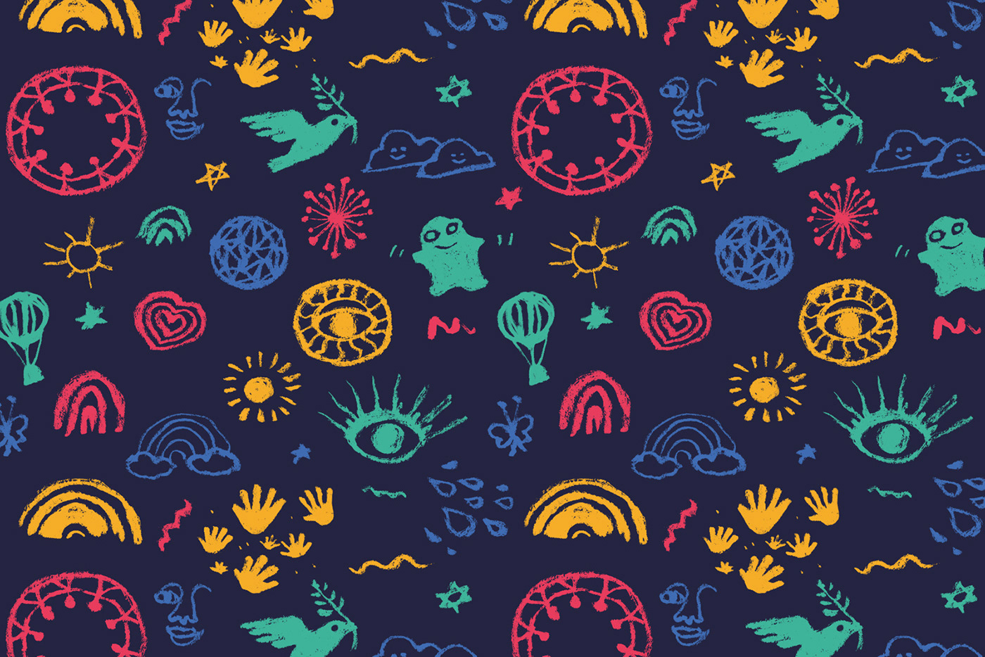
The colour palette consists with colourful hues which resembling a rainbow, reflecting the psychology of color and art therapy used in counselling. Each colour represents various human emotions and is complemented with a human skin colour.
カラーパレットは、カウンセリングで用いられる色彩心理とアートセラピーを反映し、虹色に近いカラフルな色を選出しました。それぞれの色は人が抱く様々な感情を表しており、人の肌色によって包括されています。
This logo has endured the passage of some years after the completion and is finally introduced to life alongside the fully ready business. Throughout this test of time, the client has been able to feel hopeful every time she saw it, which is one of the best and honourable feedback I have ever received. I hope this timeless logo will greatly contribute to the development of the businesses in the future.
今回、このロゴは完成されてから数年という歳月を耐え忍び、ついに準備が整ったビジネスと共に世に出されることとなりました。そしてこれらの長い年月を通じ、このロゴを目にするたびに希望を感じることができた、という素晴らしいフィードバックをクライアントから頂戴することができました。この先も時の流れを感じさせないタイムレスなロゴとして、ビジネスの大いなる発展を願っています。


